
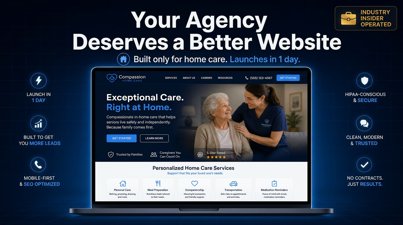
How professional design builds trust with home care families, and why a better looking competitor's site could be costing you the call.
The Decision Happens Before the Phone Rings
It is 9:47 on a Tuesday night. An adult daughter just got off the phone with her father's doctor. He is being discharged Friday and will need help at home: bathing, meals, medication reminders, someone there during the day while she is at work. She opens her phone and searches "home care near me." Four or five agency websites come up. Over the next ten minutes, she will open most of them, glance at each one for a few seconds, and quietly decide which agencies feel safe enough to call and which ones she will skip without a second thought.
She has not talked to a single caregiver yet. She has not heard your team''s training process, your response times, or what makes your agency different. All she has is your website, and in those first few seconds, it is doing all the talking.
Design Is a Trust Signal, Whether You Intend It to Be or Not
Families searching for home care cannot evaluate the quality of your caregivers from a browser tab. What they can evaluate, almost instantly and mostly without realizing it, is how your website looks, how fast it loads, and how easy it is to understand.
Researchers at Stanford's Persuasive Technology Lab studied exactly this question: what makes people trust a website? In one of the largest studies of its kind, nearly half of participants said the overall visual design of a site, its layout, fonts, and color choices, was a key factor in whether they considered it credible. Other research building on this work has found that a majority of users form their opinion of a business's credibility based largely on how its website looks, separate from the words on the page.
By the Numbers
Nearly half of people in a major Stanford study said a website's visual design, its layout, colors, and fonts, was a key factor in whether they trusted it.
Visitors form an opinion about a website's appearance in about 50 milliseconds, faster than they can consciously process what they are looking at.
That snap judgment tends to predict how the same person rates the site even after spending much more time on it.
You Have Less Time Than You Think
A landmark study published in the journal Behaviour and Information Technology found that people form an opinion about a website's visual appeal in roughly 50 milliseconds, faster than the blink of an eye, and that this snap judgment closely predicted how the same people rated the site after looking at it for much longer.
For a home care agency, this means a family does not sit down and methodically compare your services to the agency down the street. They feel something, trustworthy and current, or dated and uncertain, before they have read a single sentence. That feeling shapes everything that happens next: whether they keep scrolling, whether they look for a phone number, or whether they quietly close the tab.
What Professional Actually Means to a Family in Crisis
A professional website for a home care agency is not about flashy animations or trendy design. It is about the specific signals that tell a stressed family, often making this decision for the first time, that your agency is established, organized, and trustworthy. The things that matter most:
Real photos of your team and caregivers, not generic stock images that could belong to any business
Clear, plain language descriptions of your services, so families understand what you do without decoding industry jargon
Visible licensing information, certifications, and how long you have been serving the community
A site that loads quickly and works well on a phone, since most of these searches happen on a phone, often in a waiting room or a parking lot
An obvious, easy way to reach a real person, with a phone number visible on every page, not buried in a contact form
Dated vs. Professional: What Families Read Between the Lines
| What a Dated Website Signals | What a Professional Website Signals |
|---|---|
Looks like it has not been touched in years | Feels current, clean, and cared for |
Generic stock photos of unfamiliar people | Real photos of your actual caregivers and office |
Slow to load or hard to read on a phone | Loads quickly and works well on any device |
Service descriptions full of unfamiliar terms | Plain language explanations families can follow |
Phone number is hard to find | Phone number is visible on every page |
The Lead You Never Knew You Lost
Here is the part that should concern every home care agency owner: you might have better caregivers, faster response times, and a stronger reputation in your community than the agency across town, and still lose the lead, because their website looked more current than yours.
Families in crisis rarely call four or five agencies and compare notes. More often, they call the one or two that felt the most trustworthy in those first few seconds, and if that first call goes well, the search ends there. The agencies whose websites looked outdated, slow, or confusing simply never get the call. There is no message left behind, no feedback form explaining why. The tab just closes.
This is the quiet, compounding cost of an outdated website. It does not show up as a complaint or a lost contract you can point to. It shows up as a phone that rings a little less often than it should, month after month, while a competitor with a stronger online presence absorbs the inquiries you never knew existed.
Your Website Is the First Caregiver Interaction
Think of your website as the first interaction a family has with your agency, because that is exactly what it is. A clean, current, easy to navigate site tells a family, before anyone picks up the phone, that this is an organization that pays attention to detail and takes its responsibilities seriously. An outdated or hard to use one raises a quiet doubt, even if everything else about your agency is excellent.
For an industry built on trust, where families are handing over the care of someone they love, that first impression carries more weight than almost any other marketing investment you can make.
Sources
Stanford Persuasive Technology Lab, Stanford University. Stanford Web Credibility Project.
Lindgaard, G., Fernandes, G., Dudek, C., and Brown, J. (2006). Attention web designers: You have 50 milliseconds to make a good first impression. Behaviour and Information Technology, Volume 25, Issue 2, pages 115 to 126.